

 It’s time for a new look!
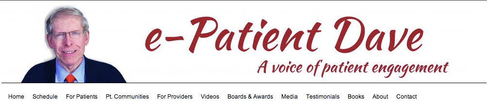
After three years with a “Facebook Blue” banner at the top of the site, I’m switching to this new one. This one does two things:
- It uses the graphic identity of my book cover, Let Patients Help.
- It takes advantage of the new publicity photo all patients got (free!) at the Medicine X conference at Stanford this year.
In a way, my face is as close as I’ll get to a logo. :) I worked for a couple of months this summer with design consultant Jonathan Klein, trying to figure out what I wanted to convey. Then the other day while talking with my web consultant Alicia Staley (mid-flight!) this idea evolved. Love it! Great ideas pop to the surface when @Stales and I jabber.
Finally, my book cover designer Tania Helhoski of BirdDesign Studio did the art, since she also created the book cover this was based on.
What do you think? Give us love! Or pick the nits.
p.s. There’s more to come – more changes along the same line. Big things in the wind!
LOVE IT!
Love the facelift amigo! Fresh, clear, simple. great signal to noise ;->
Looks great!
“my face is as close as I’ll get to a logo” = LOL in the most joyful way. Love the new look!
Yes I do like the overall banner, I’m just a nit-picker.
I calibrated my monitor 3 days ago. So there’s a change I may have the correct color range.
I think your image is too ruddy. I have seen better images of you. Have someone skilled in PS6 decrease the level of ruddy red on the face tones.
Then the human beauty of ePatient Dave Ep. that Ginny sees!) will show thru.
Also…a slight turn of the head, is always better than a straight head shot…but too late for that. Yes …I am a nit-picker. Dave
Excellent feedback! I asked for nits, and the good photographer show up with nits!
As always, I did what I could with what I have. Let’s see if any Photoshop wizards show up! (You’re not one, are you?)
Dave, I agree, a bit too red and ruddy especially for this time of year in New England. You look like a damned cancer survivor or something like that. But I like it.
Dave, you need a gradient, more realistic shadow behind your silhouette. The flat gray, weirdly cut shape makes you look fuzzy/outa focus and is, I must say it, amateurishly executed.
I like the logo part but can agree with comments about the photo – especially the comments that it makes you look out of focus. But if you can ignore the ‘shadow’ then you aren’t out of focus in the photo.
I LIKE IT!!! (I also like the “A” in “A Voice of Patient Engagement” :-)
You’ve given all of us ‘little’ people to also be other voices –
Most awesome, my friend!
Amateurishly executed – you guys crack me up :-) … well, I did what I could with practically no budget, guys. :)
Well, I’m pretty happy with it, so I guess that’s the end of that! (And, btw, I already did de-ruddy it, from the one that a serious photographer already commented on above…. so yeah, I can listen ..:-))
Hey y’all! I asked for feedback, and boy did I get it – made some changes – better?
I don’t know what happened to the photo – how it got ruddy – now I replaced it with the original from Medicine X and it seems much better at my end. Also changed some of the geometry in the banner and futzed with other things.