 I’ll leave you with this thought for the weekend.
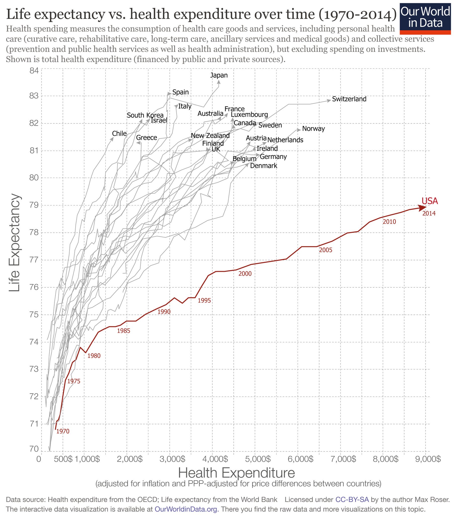
After years of study of healthcare around the world, listening to an immense number of arguments about what’s important and what works and doesn’t, it’s all summed up in this one picture. The Y axis is life expectancy; the X axis is cost. This graph has been tweeted furiously and often lately by health journalist @DanMunro. (More on him below.)
You can easily see that US health costs per capita are way, way, way out of whack with the rest of the world. And, the life expectancy we get for it is years worse than the countries that cost 2-3x less.
Some will argue bitterly that the facts aren’t relevant, or a hundred other arguments. I’ve lost interest in those arguments, because they’re all about rationale, and no rationale is worth a damn if the outcomes they’re trying to explain don’t match the rationale.
No more arguments about it.
So I won’t argue back anymore. I just want everyone to think about this and ask themselves what they’re going to do about it.
As I said above, this graph has been tweeted often lately by health journalist @DanMunro, whose short, understandable, potent book Casino Healthcare explains just one part of the situation – the annual “spin of the wheel” open enrollment period, in which insurers try to tip the table so that for the next year they get a beneficial population of patients.
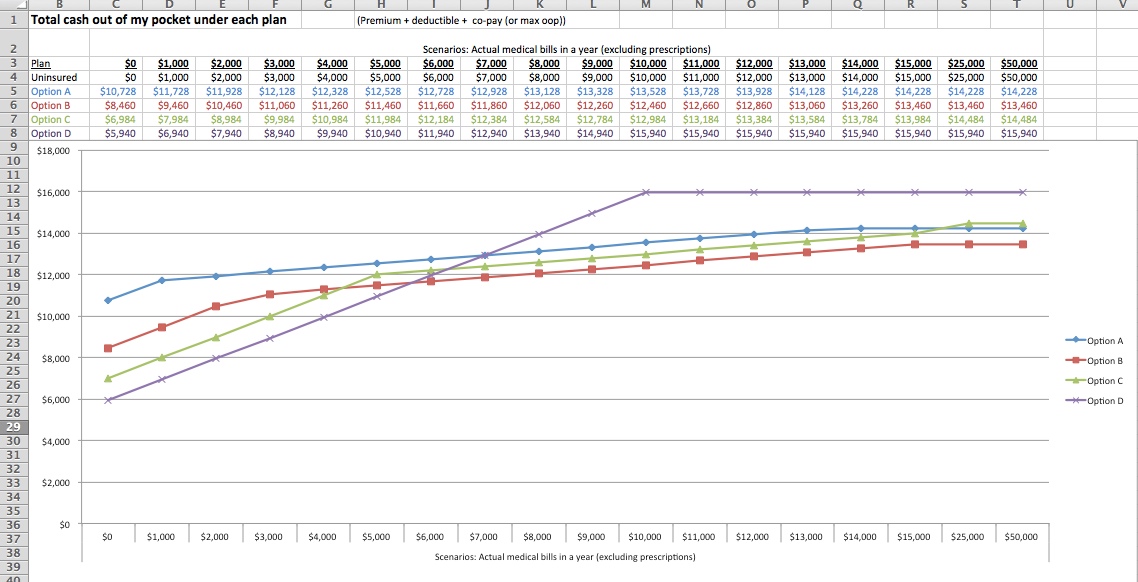
 A huge problem is that they have all the data on us, and we don’t – remember what it was like when I tried to choose an insurance plan in 2012 and had to use all my Excel skills. (The graph here links to that post. It’s part of what I had to go through, just to make a sensible choice among five high-risk plans.)
Other aspects of the cost problem are documented in the April book An American Sickness, which I haven’t written about yet, but trust me when I say it’s painful to listen to: every single bit of the US healthcare system has been sliced up into micro industries where every individual player is pursuing its own highly localized interests. That’s why, for instance, so often today a hospital bill is handed quickly to collection agencies, who have no soul – their only income is what they get out of the sufferer.
Note, I’m not saying physicians are ripping us off. To the contrary, physician satisfaction is a big problem these days. (Some specialists are, but not most.) I’m just saying that you and I need to be well aware that something’s gone haywire financially somewhere in American healthcare, and watch out.
See also my recent page on the New Orleans investigative journalism series “Cracking the Code.”
On a related note, this week I wrote on the e-patient blog about a new article in Lancet on how 195 countries do on a lovely metric called “amenable mortality” – “deaths from certain causes that should not occur in the presence of timely and effective health care.” The US system ranked 35th, with an 81, in the same range as Latvia, Bulgaria, Romania, Lithuania, Croatia (77-82), while the Swiss and Scandinavia and Canada and Oz were all 90+.
Just think about it. Somebody in the system is taking a whole lot of money out of us and not giving us the best care in the world.


Some of you may remember when McDonald’s, in its Golden Arches days, used to have changing signs showing the nationwide cumulative total of all the burgers it had ever sold. It was fascinating watching the number grow and you couldn’t help wondering if one of your burgers put the number over the top to its next milestone. What is MY contribution to this sign?
In Osaka, Japan, incongruently in a busy intersection near an ancient castle and moat, there used to be (don’t know if it’s still there, saw it decades ago) a low tech changing billboard just like the McDonald’s sign. I asked what it said and was startled to learn that it was counting auto accidents and casualties, to warn people to drive more carefully. Hearing that, I felt the pressure of community resolve that no one seeing this sign would want to be responsible for growing the dire statistics.
A couple of weeks ago, an interstate highway sign that might say anything or nothing at any time beamed me a similar message: traffic deaths so far this year in Connecticut. Thought I was driving pretty safely, really, but I slowed down and focused more just the same.
Perhaps a live version (a bit like the national debt clock) of the healthcare results and costs graph in this post should be in all hospitals as well as at the entrance of the HHS building and in the meeting and hearing rooms of the health committees on Capitol Hill. It would be good for all of us, all the time, to realize the basic facts of the mess we’re in so we can come together: all for one, one for all. That’s what healthcare should be but we won’t get it unless we are aiming for it, and aiming to win.